What We Love About Decorator’s White OC-20
True to its name, Decorator’s White is a popular shade of white among designers and architects. It’s an almost-pure white that displays a cool gray vibe due to its faint gray undertones. Decorator’s White is an ideal choice for trim and decorative woodwork because it can be relied upon not to yellow over time. This soft white blends beautifully with marble and stone, so it’s an excellent choice for bathrooms and kitchens. It’s a modern, bright white that can be used as an all-over interior paint color for a living room or for homes with an open floor plan. Decorator’s White is part of the Benjamin Moore Designer Classics Color Collection, which consists of colors that you can pick with confidence.
Decorator’s White Has Cool Undertones
Decorator’s White is one of Benjamin Moore’s most popular white paint colors. While it appears at first glance to be pure white, Decorator’s White has subtle undertones of gray and purple that make it a slightly cool white. The undertones are subtle enough that you can hardly see them until they’re paired with a white that carries a hint of a yellow undertone. Decorator’s White looks its brightest and whitest when paired with cool wall colors like gray and blue. While Decorator’s White tends to lean toward a cooler tone, it’s not as cool as Benjamin Moore Chantilly Lace.
Like many whites, the undertones at play in Decorator’s White change based on the surrounding lighting. In sunny South-facing rooms with yellow light, Decorator’s White will come off as a softer, but not creamy white, unlike an off-white alternative like Swiss Coffee. Warm wall colors like green or yellow can bring out its cool undertones even more and may give it a grayish cast. In North-facing rooms or cold climates, the blue undertones become more pronounced, and Decorator’s White might appear even grayer. Your interior design scheme and companion paint colors may also highlight one undertone more than the other.
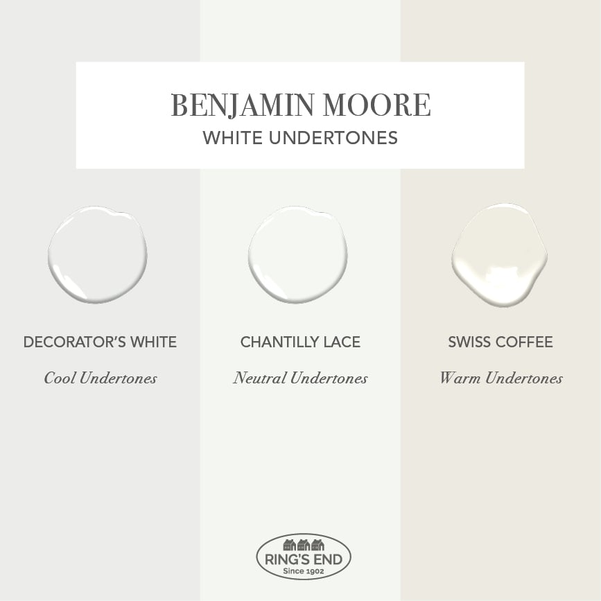
Undertones in Decorator’s White vs. Chantilly Lace and Swiss Coffee
With a light reflectance value or LRV of around 84.61, Benjamin Moore’s Decorator’s White is close to a true white. However, when it’s used alongside a brighter white like Chantilly Lace you can tell it’s not pure white; its slightly cool undertones will show. Decorator’s White is the perfect choice for either interior or exterior paint when you want a true white that’s not too bright or stark.
Where To Use Decorator’s White By Benjamin Moore
Decorator’s White is the perfect white for a quiet backdrop for bold, colorful art. It’s a DIY favorite for living rooms when you want your room to pop through accessories and furnishings. It’s the perfect white paint on kitchen cabinets and in bathrooms alongside the popular gray of a marble shower and backsplash.
The slightly cool undertones in Decorator’s White make it a favorite white of interior designers for both walls and trim. It sets off color trends like pastels and coastal shades beautifully and has a complexity that adds interest to white walls in big and small spaces.
Benjamin Moore Decorator’s White, Buxton Blue
It’s also crisp enough to set off today’s popular gray shades, looking wonderful on both ceilings and trim.
Benjamin Moore Decorators White & Coventry Gray
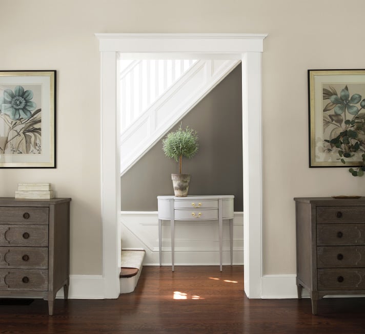
Its popularity as white color for trim and woodwork means Decorator’s White is often used on stairways.
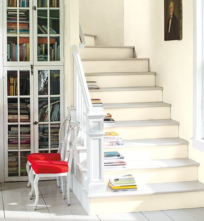
Stairs in Benjamin Moore Decorator’s White
Decorator’s White is nice and crisp, so it provides a nice contrast with deep colors like Hale Navy:
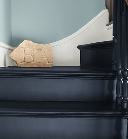
Benjamin Moore Decorator’s White on trim with Hale Navy stairs
The cool undertones in Decorator’s White are ideal for kitchens; here it complements gray-white tile and an island in Benjamin Moore’s Hale Navy:
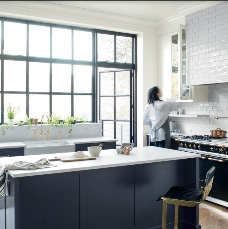
Kitchen with Benjamin Moore Decorator’s White walls and Hale Navy cabinets
Cool undertones make Decorator’s White an ideal trim color against warm neutrals, like the popular Revere Pewter:
Decorator’s White stays true to its cool undertones, even under warm lighting. Here it creates a neutral ground for bronze and black fixtures despite the yellow cast of the wall light:
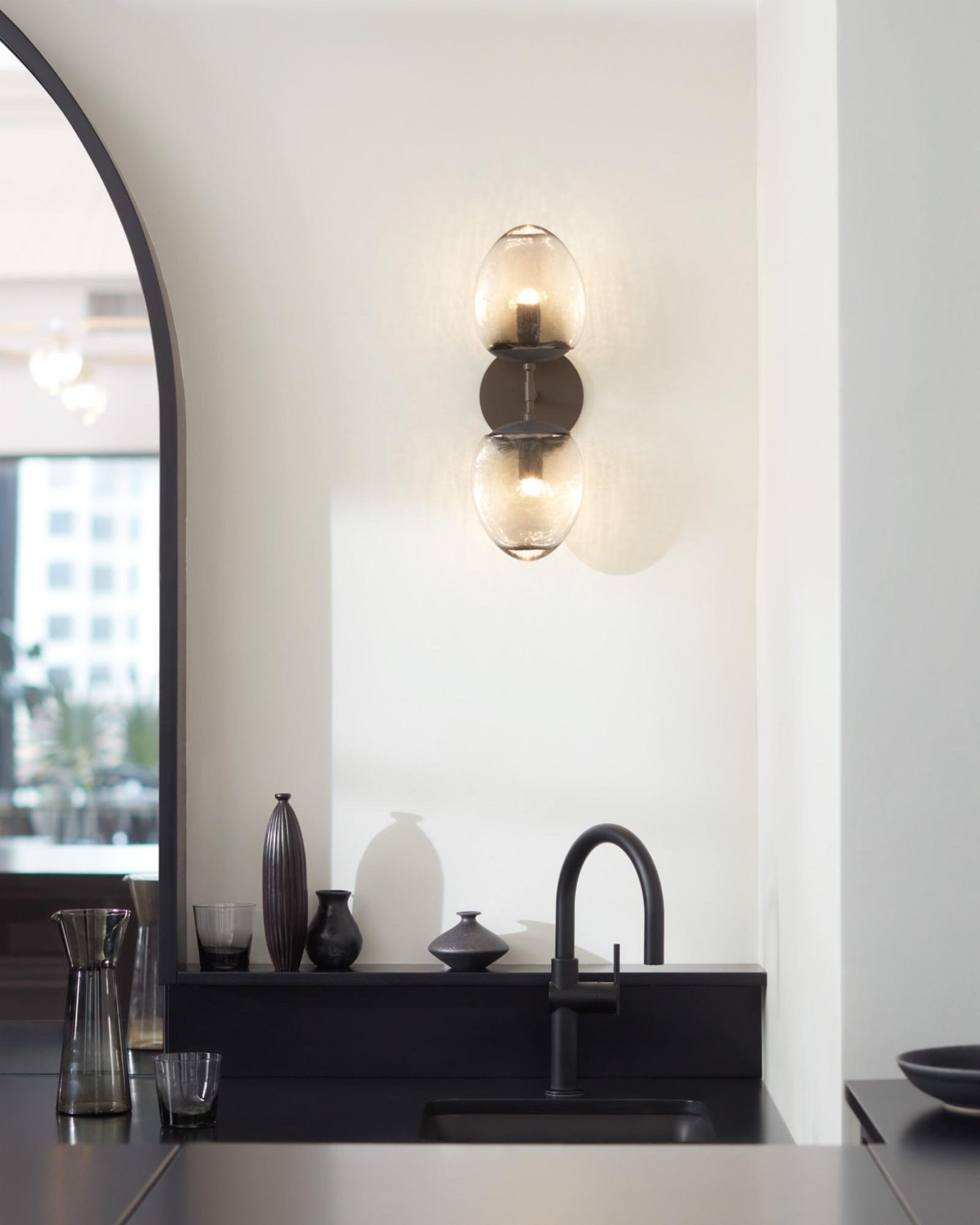
BM Decorator’s White in a bar area
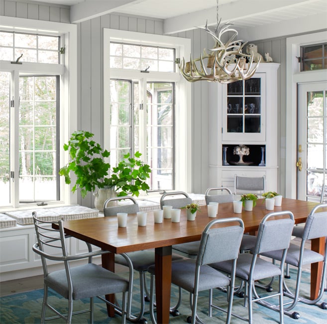
Wood tones and greige linen bring out the gray undertones just a bit more:
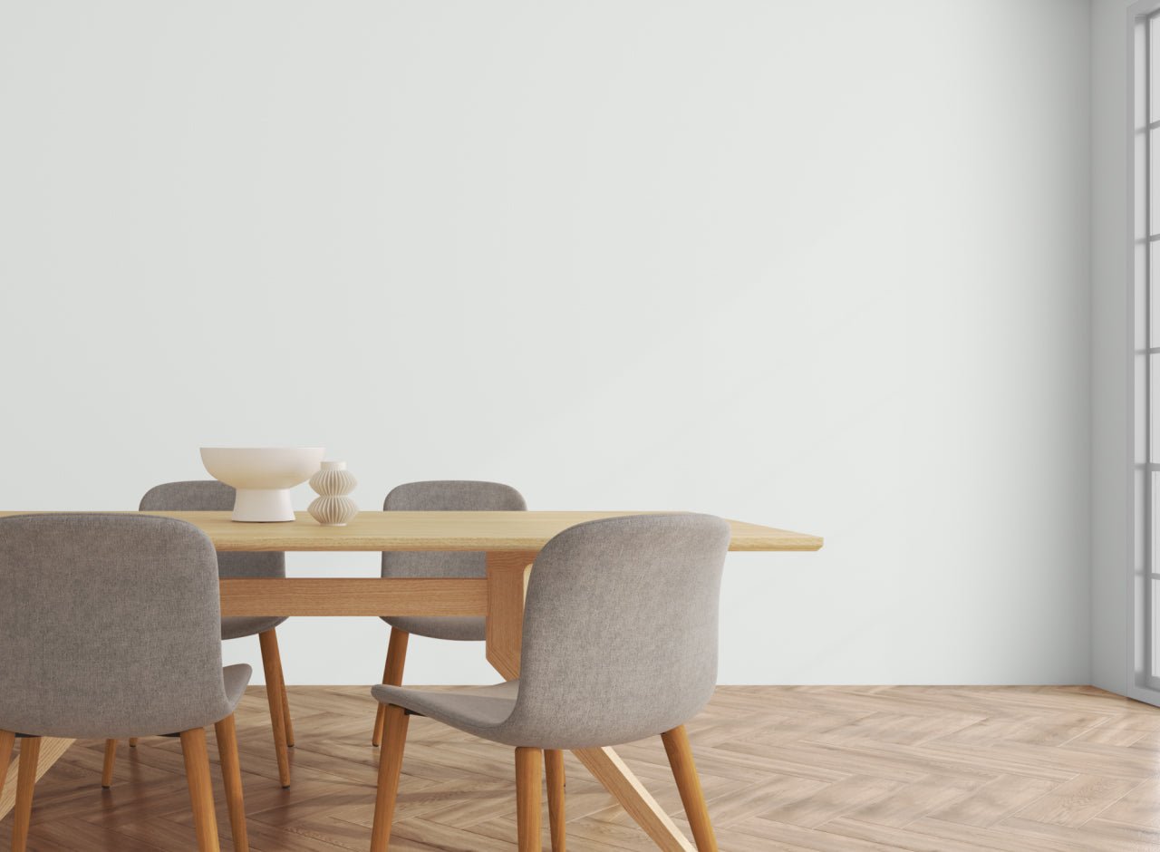
Benjamin Moore Decorator’s White in a dining room
Other Benjamin Moore Paint Colors You May Like
Decorator’s White is admired for the cool undertones that make it pair well with cool blues, grays, and blue-greens. We love how it looks with the dark blue of Benjamin Moore’s Hale Navy or the blue-green of Wythe Blue. It’s the perfect trim color for a pale gray like Moonshine, and it gives neutral grays like Metropolitan a crisp, clean quality.
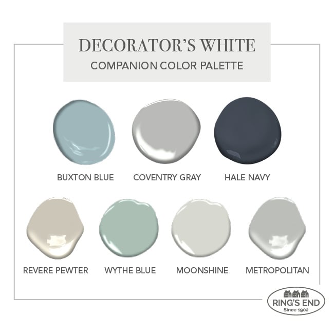
Benjamin Moore Decorator’s White color palette
Other Similar Colors
Testing white paint colors to find just the right shade takes time, but our Benjamin Moore Color Guides help make the process a lot easier. If you’d like a white with more neutral gray undertones, try Benjamin Moore’s, White Dove. Paper White, also part of the Off White Collection, will give you a bit more gray. For a bit warmer, creamier white, try Swiss Coffee, Oxford White, or Simply White.
There are even more options available in the Benjamin Moore White & Off-White Collections.
Buy A Decorator’s White Benjamin Moore Paint Sample
All white paint colors are susceptible to shifts in an undertone that could make them appear cooler or warmer, depending on the lighting conditions and time of day. We recommend testing a sample of Decorator’s White and any other options you’re considering before deciding on your final choice.
One of our designers’ favorite tips for an easy way to test paint swatches on multiple walls in your house, is to paint a large poster board using a Benjamin Moore Paint Color Sample and move it around the room to observe the color on different walls and in different lighting conditions.
Once you’ve settled on your color choice and are ready to order your paint, come back here for free shipping* on our best-selling Aura Waterborne Paint.
*Free shipping on all standard orders of $150 or more