With its enormous range of undertones, the blue color family never goes out of style. This favorite color pairs perfectly with complementary yellows, and works beautifully with analogous shades from violet to aqua or green. From deep navy to pale aqua, and every shade in between, Benjamin Moore offers blues for every project.
A blue paint color can have either warm or cool undertones that effect the mood of a space. Check out some of the most popular choices in each family of blue, then order a sample of your favorites to try in your space!
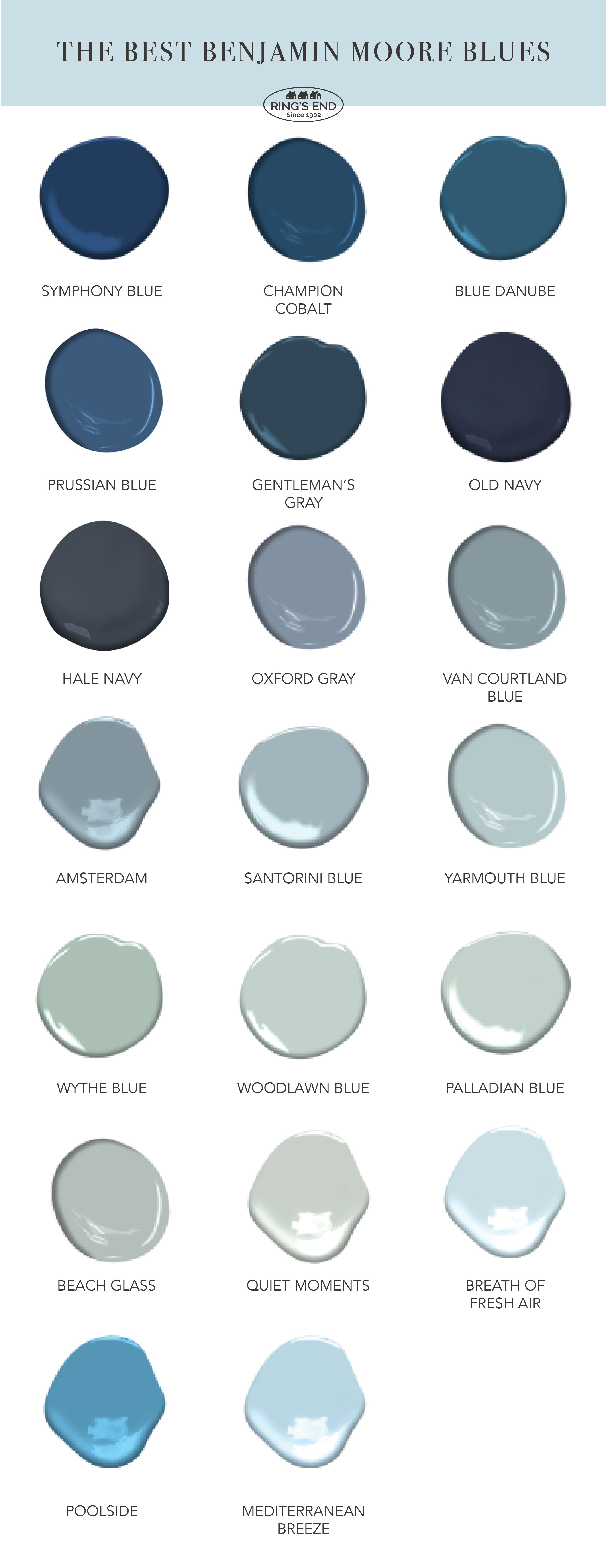
Benjamin Moore’s Most Popular Blue
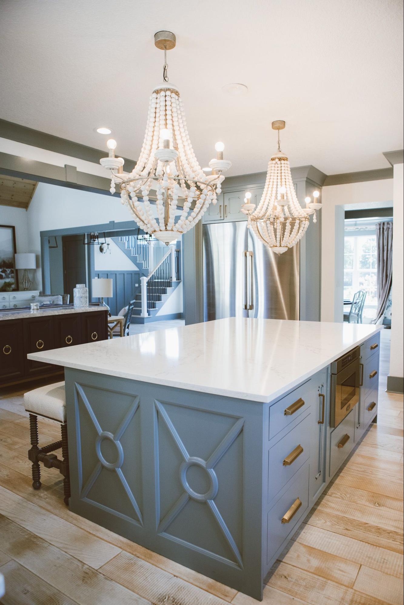
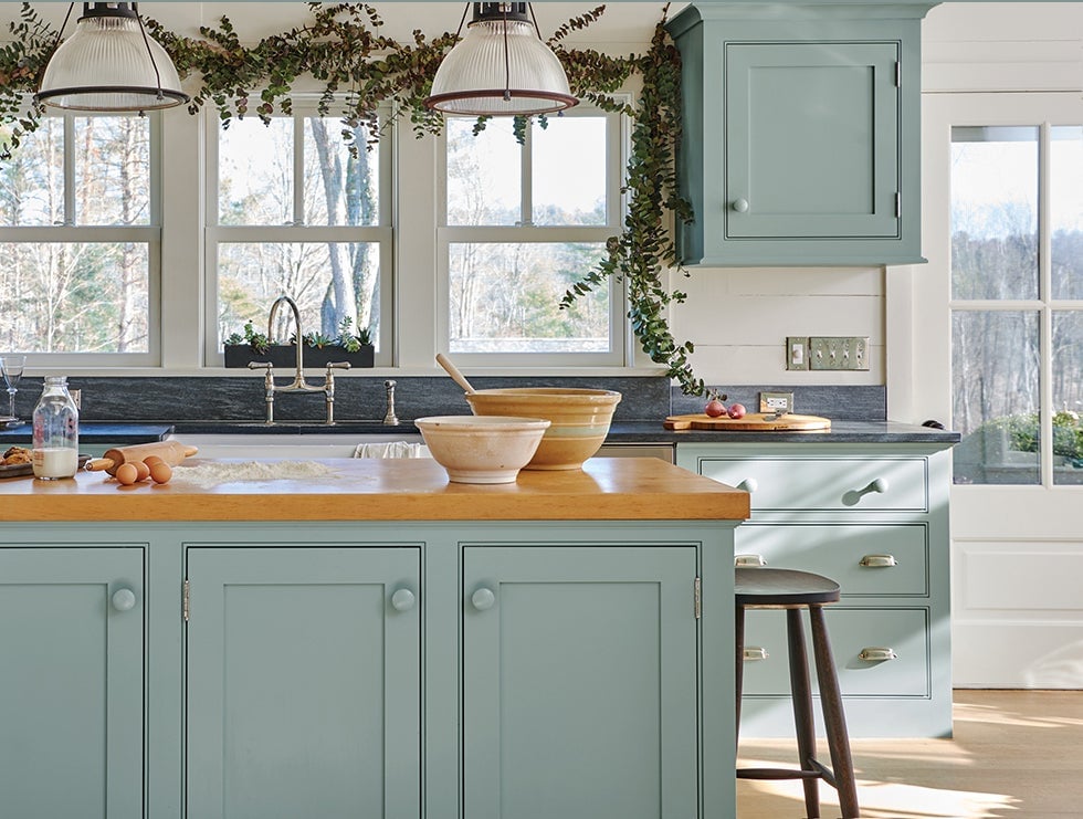
Hale Navy, Benjamin Moore’s iconic gray-blue navy, their best-selling blue color and one of the most popular paint colors on the market today.
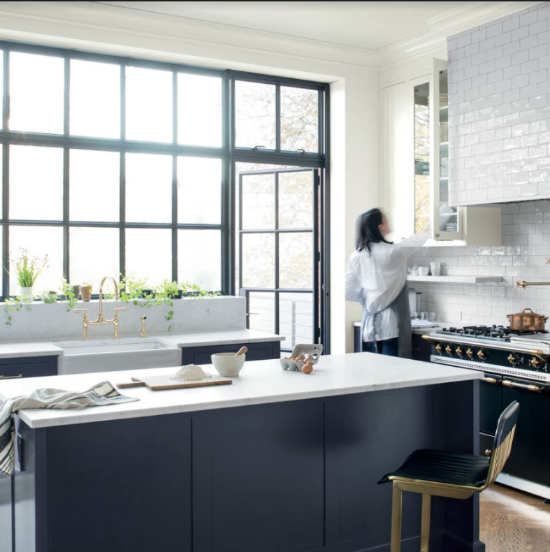 Benjamin Moore Hale Navy Kitchen Island
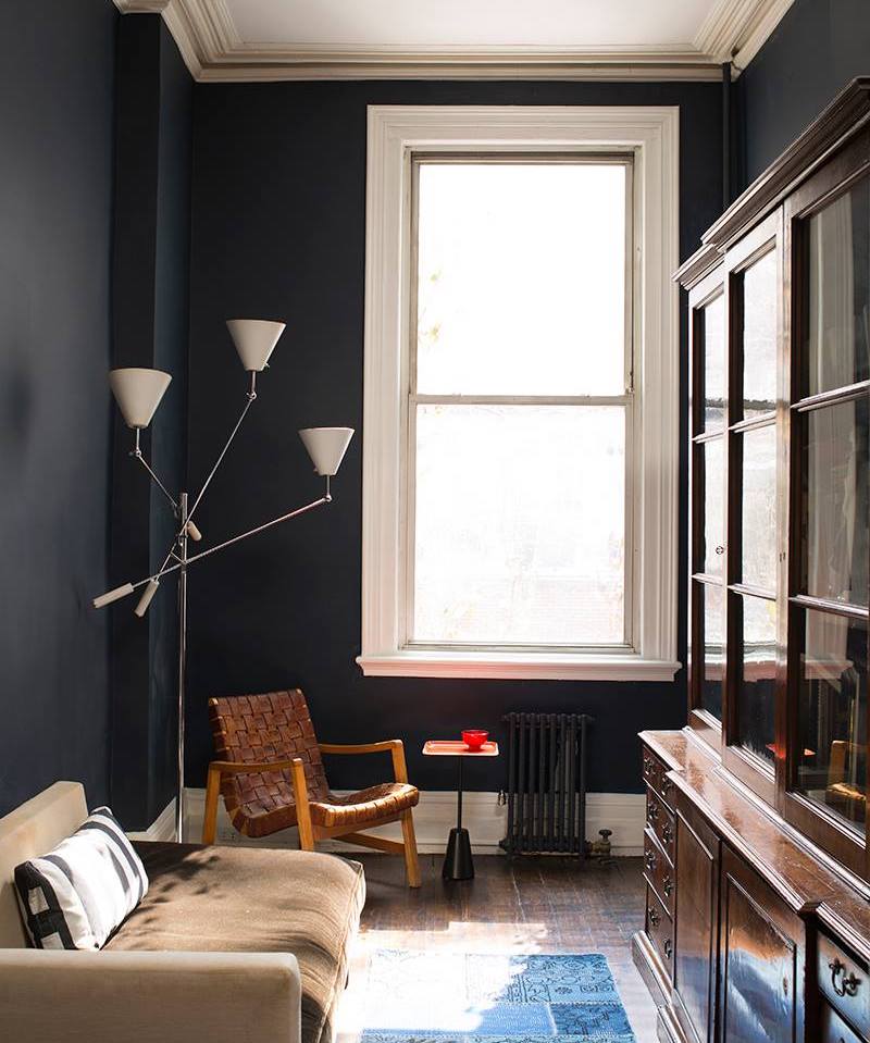
Nearly an off-black, Hale Navy has gray undertones that coordinate perfectly with neutral colors, especially warm gray or greige. Keep in mind it is a very dark color. Although it looks great in different lighting situations, it may be too dark for your taste in a room without natural lighting. However, it’s a great choice for an accent wall and it looks sharp on cabinetry, bookshelves or even a front door. To see more images, inspiration, and ideas for Hale Navy, check out our full color review!
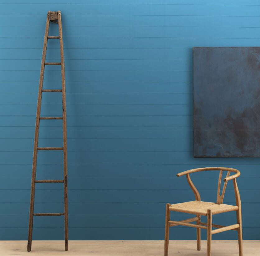
Benjamin Moore Dark Blues
Midnight, cobalt and navy blues create elegant, cozy spaces that let art and furnishings shine. Dark blue is a classic choice for cabinetry, bookshelves, walls or trim. For a modern look, paint an accent wall around a fireplace, or use it as all-over color for a traditional master bedroom. Pair them with crisp white trim in Benjamin Moore’s White Dove for a traditional look, or create a soothing envelope by painting walls, trim and ceiling the same deep blue shade.
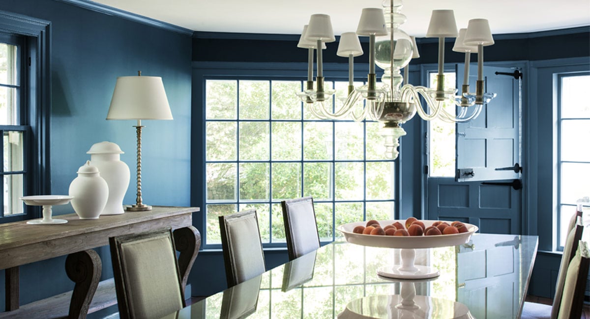
Symphony Blue 2060-10
Symphony Blue is a classic shade of navy with nautical flair. Solidly blue and not too dark, it’s a New England preppy navy that pairs nicely with traditional shades like Marblehead Gold. Trim it with a slightly warm white like Benjamin Moore’s Cloud White.
Champion Cobalt 2061-20
Another elegant dark blue, Champion Cobalt, takes a deep royal blue and adds a hint of teal to give it a bit of intrigue. Complement this saturated blue with a warm, rich neutral like Pale Oak on the ceiling; using a color instead of white softens the ceiling line.
Blue Danube 2062-30
Blue Danube is a stylish dark blue that shows interesting teal undertones, especially in bright lighting. It’s lively enough that it won’t make a room look too dark, yet deep enough to create some drama. If your adjoining rooms have gray paint colors, Blue Danube is a great choice.
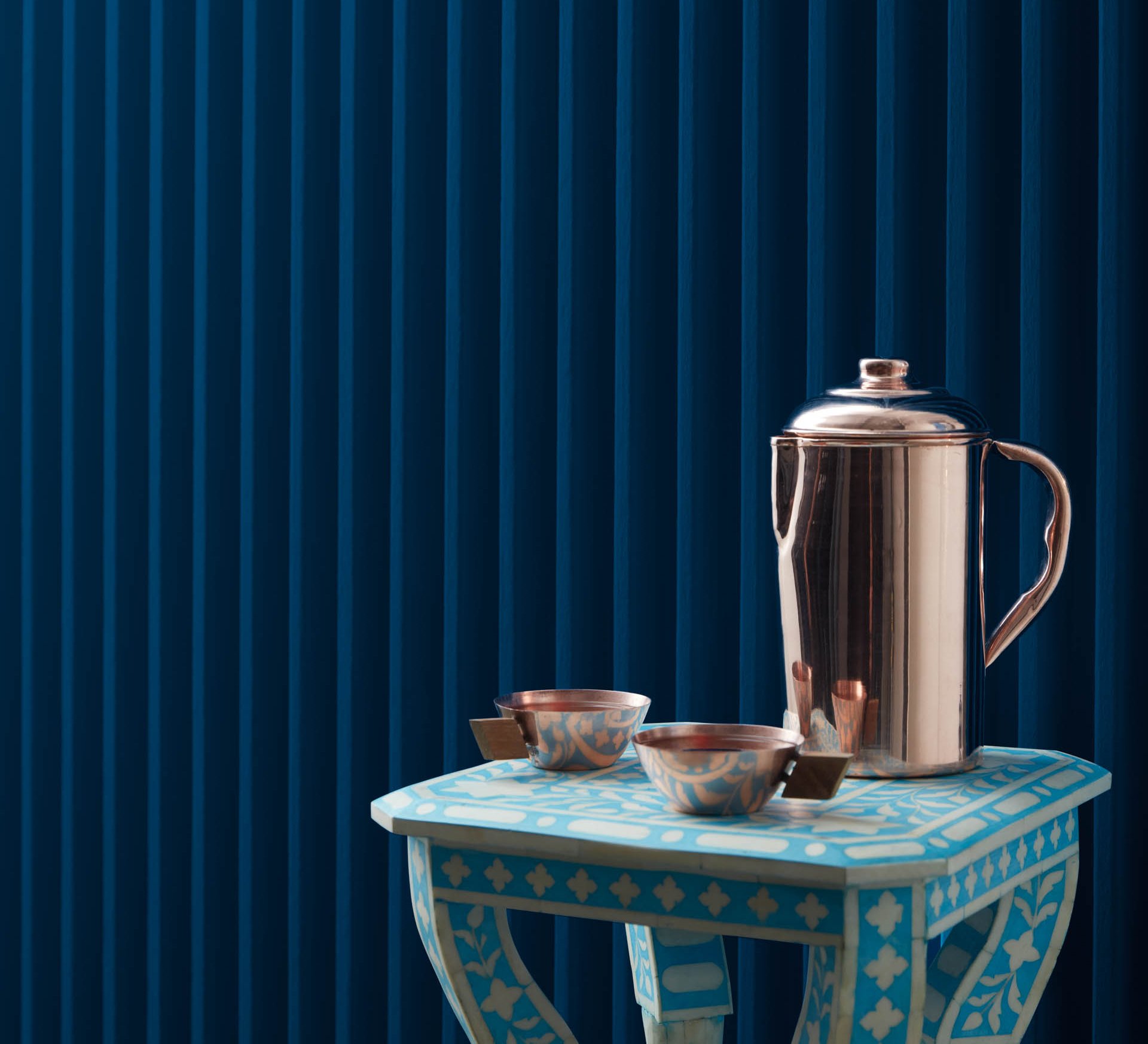
Prussian Blue CW-625
Inspired by the Old World pigment, Prussian Blue is a jewel tone that evokes blue-and-white Chinese porcelain. It’s a deep, bright blue with a complexity that always looks sophisticated. A unique blue with indigo and teal undertones, it works beautifully with either traditional or modern decor.
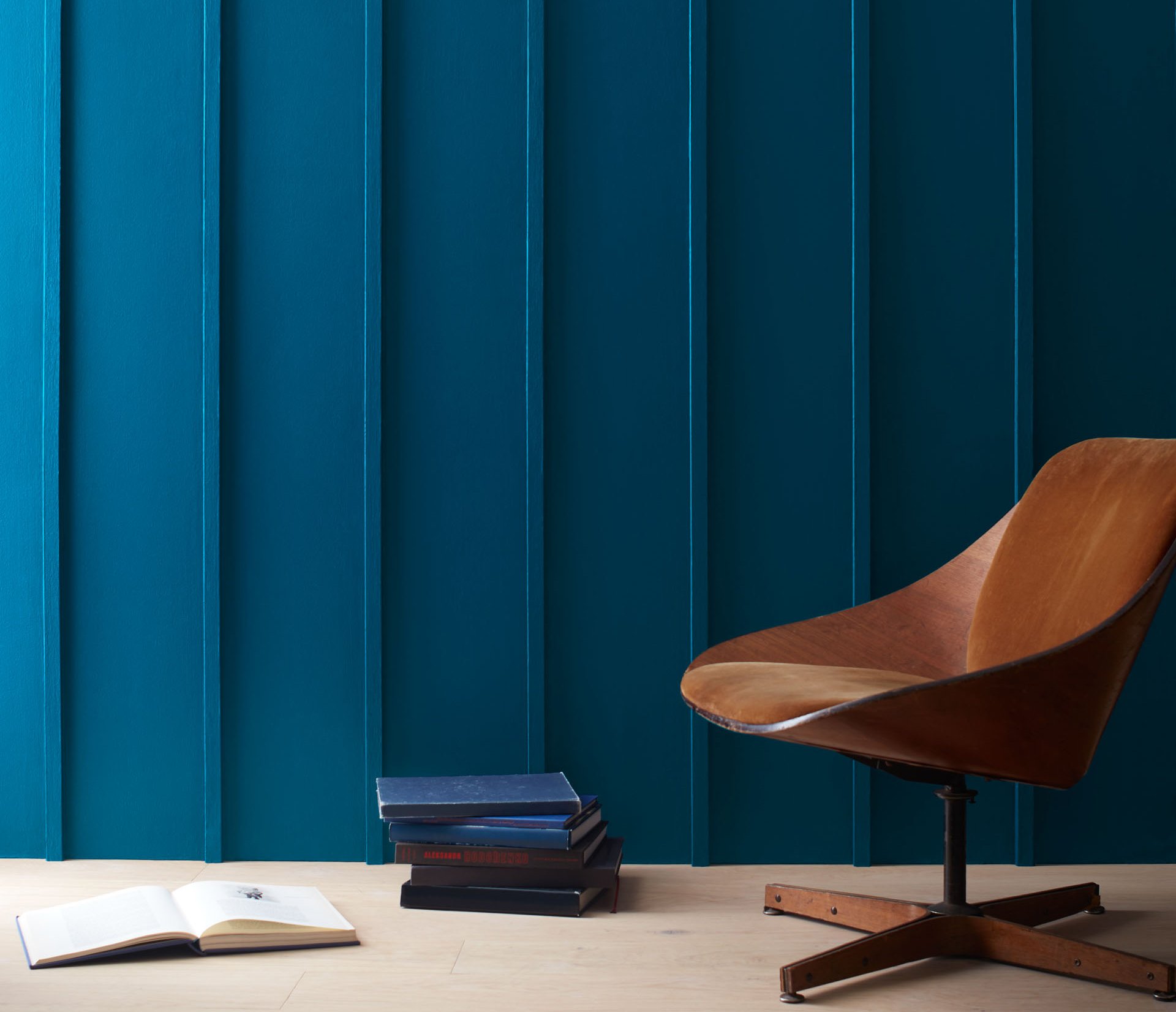
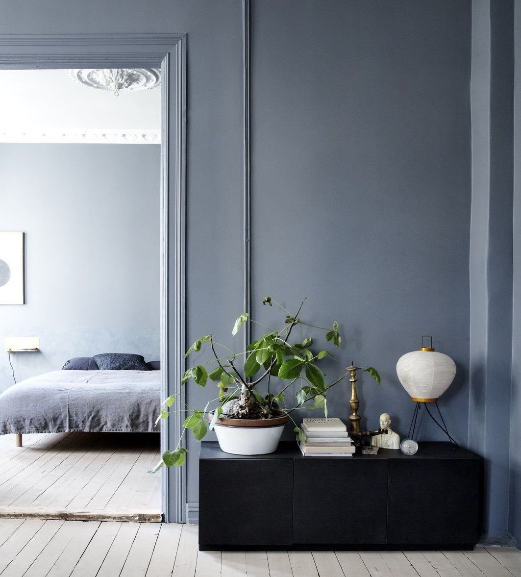
Gentleman’s Gray 2062-20
If you’re looking for a deep teal blue with a modern bent, you’ll love Gentleman’s Gray. Charcoal undertones balance out the blues to create a restrained, modern dark blue. Stormy Monday‘s taupe with violet undertones makes a perfect neutral to complement Gentleman’s Gray. Pair them with Decorator White for slightly gray undertones on the ceiling.
Old Navy 2063-10
A true navy blue that’s perfect for both traditional and modern interiors, Old Navy has deep indigo blue undertones that give it a classic feel. You can rely on Old Navy to appear neither teal nor gray, even in bright lighting conditions. This classic shade makes a great accent color. Pair it with earth-inspired neutral paint colors like Stonington Gray or October Mist for a timeless look.
Van Courtland Blue HC-145
Van Courtland Blue is part of Benjamin Moore’s Historic Collection (also known as James River Gray AC-23 and Water's Edge 1635). It’s an elegant, Old World blue that displays Mediterranean influences in its gray undertones. While it has a traditional vibe, it also works well in contemporary spaces and complements art and furnishings beautifully. This gray-blue shade looks best with slightly warm white colors like Benjamin Moore’s Simply White.
Amsterdam AF-550
Another inspired medium blue, Amsterdam is described by Benjamin Moore as “an appealing blue-gray that merges Old World elegance and modern industry.” Gray undertones add cool complexity, while aqua hints fit a historic color palette. This modern color is ideal for vintage and industrial spaces, complemented by a warm neutral.
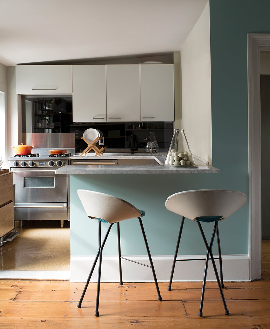
Aegean Teal 2136-40
Aegean Teal is a sophisticated, warm blue-green that channels hazy Mediterranean skies with a touch of gray. It’s deeper than Amsterdam, but has the same complex quality with aqua undertones.
Yarmouth Blue HC-150
Yarmouth Blue is another color from the historic palette that has a lively blue-green tint. Without any gray undertones to tone it down, it creates an airy, summery vibe. It’s one of Benjamin Moore’s most popular medium blue colors.
Wythe Blue HC-143
Wythe Blue was Benjamin Moore’s Color of the Year in 2012, and it retains its popularity as a go-to color for traditional interiors. It has a changeable nature and may look more blue-green or blue-gray depending on the lighting. A wonderful color for cabinetry, or as a backdrop for antiques, Wythe Blue looks great with both light and dark wood tones. You can see more photos in our Wythe Blue review.
Poolside 775
Poolside (not to be confused with Poolside Blue 2048-40) is a saturated peacock blue that is calmed by a hint of gray undertone. This tropical shade conjures the ocean, but its versatility extends far beyond resort spaces. It can serve as a bright backdrop in a traditional room, or a bold accent in a contemporary space. Paint ceilings or adjoining walls a neutral-cool white like Benjamin Moore’s White Dove to make it pop.
Oxford Gray 2128-40
For a medium blue with indigo, not aqua, undertones, check out Oxford Gray. This color is a great substitute for navy blue if you’re seeking a lighter shade. In some lighting, Oxford Gray can appear as a deep blue-gray paint, but it’s quite never as dark as a navy blue. Khaki-tan and yellow paint colors, as well as light wood tones, complement this blue perfectly. This historic home uses Oxford Gray on the walls and trim for a serene, monochromatic color scheme.
Mediterranean Breeze 799
Looking for a sky blue that conjures a relaxed breakfast by the Mediterranean Sea? Bring your vacation home with Mediterranean Breeze, a powdery blue that’s fresh as a summer sky.
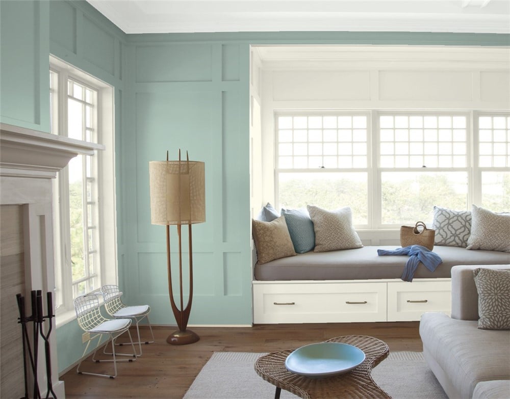
Woodlawn Blue HC-147
Woodlawn Blue creates a vintage vibe with the palest shade of old blue-green glass. This versatile color is equally at home in a beach house or a historic mansion; pair it with warm neutrals like Chelsea Gray for an elegant, understated look. See more photos in our Woodlawn Blue Review.
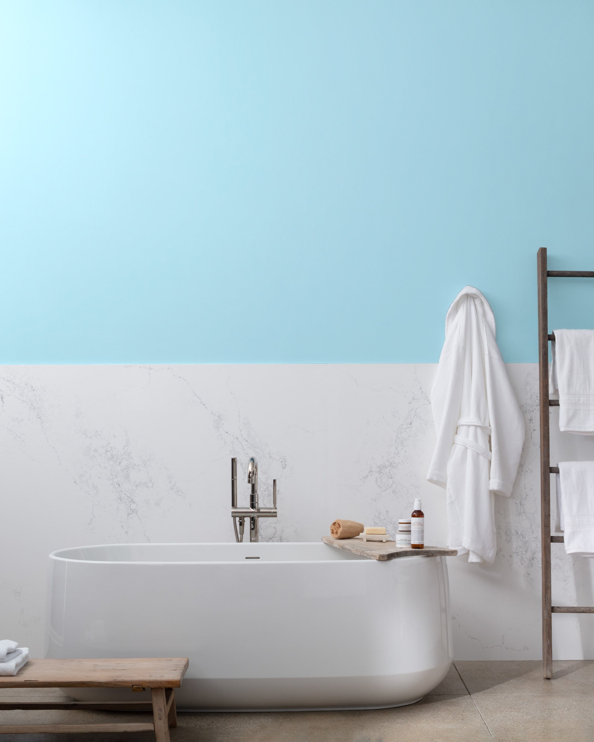
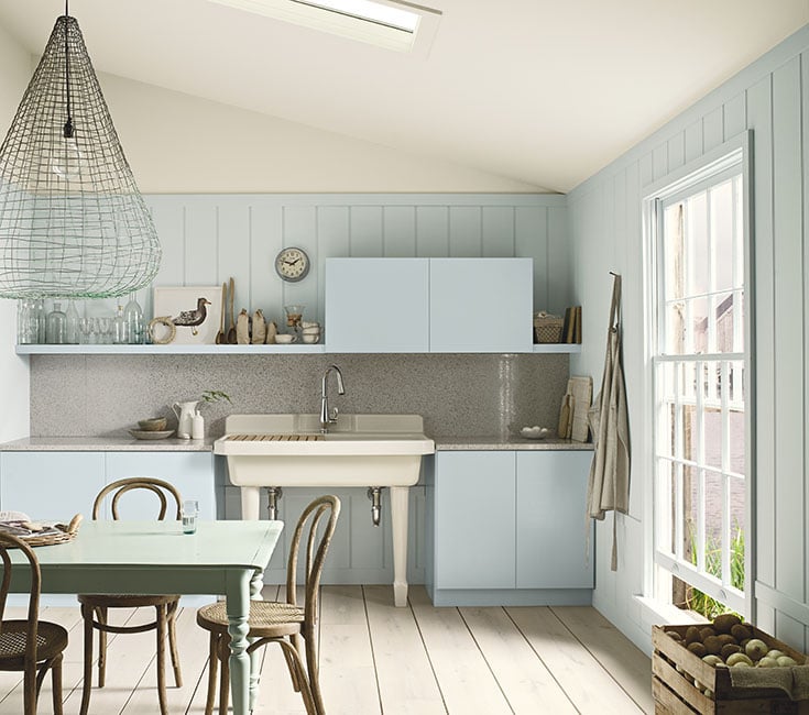
Breath of Fresh Air 806
The Color of the Year for 2014, Benjamin Moore’s Breath of Fresh Air is a pale, powder blue that’s elegant and just a touch feminine. It’s a versatile shade that can change depending on the lighting and nearby colors. Here it appears blue against wood and gilt antiques.
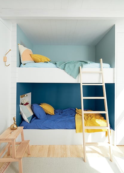
Iceberg 2122-50
In this modern kitchen, Breath of Fresh Air on cabinets takes on a grayish-blue look against other pastels, and paneling painted Benjamin Moore’s Iceberg.
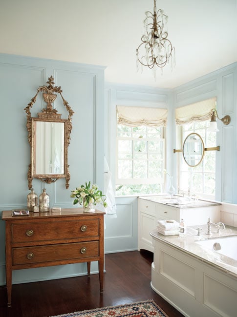
Palladian Blue HC-144
Possibly the most popular light blue from Benjamin Moore, Palladian Blue is a soft, airy blue with complex undertones that can seem either cheerful or moody. It has green undertones that will shine in a bright space, while darker, cool light will pull out the blues. Like most pale blue colors, Palladian Blue works beautifully with both light and dark wood tones. Warm neutrals like Chelsea Gray or Edgecomb Gray are the perfect companion shades for adjoining walls or woodwork. See more photos in our Palladian Blue Review.
Beach Glass 1564
A step lighter than Palladian Blue, Beach Glass is exactly as the name suggests —a serene, calming light blue with a gray undertone.
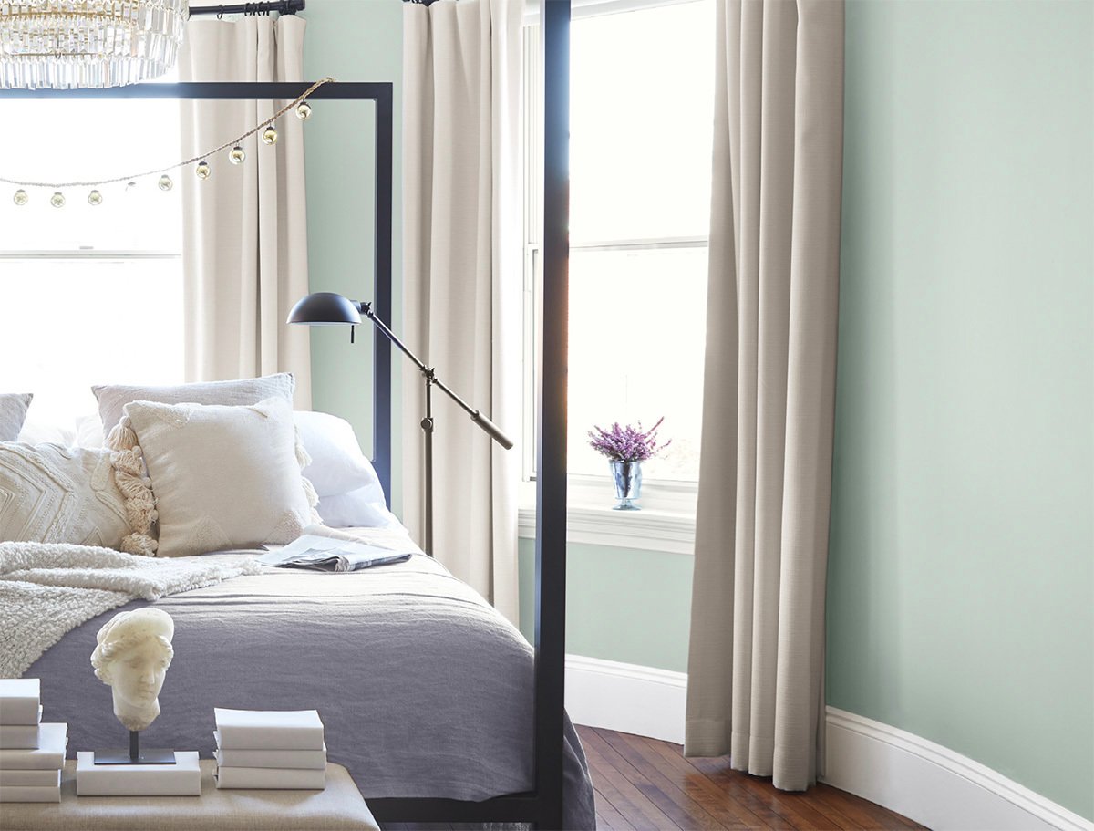
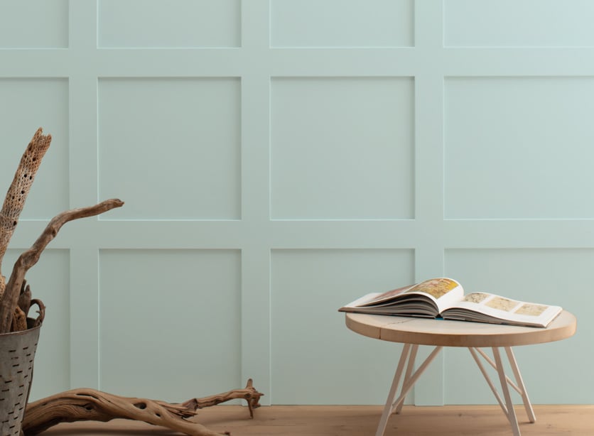
Quiet Moments 1564
Quiet Moments is so pale it’s almost off-white in the sunshine. With a mix of green and gray undertones, this very light blue exudes tranquility. Use it alongside a crisp white like Cloud White to bring out its complex cool tones.
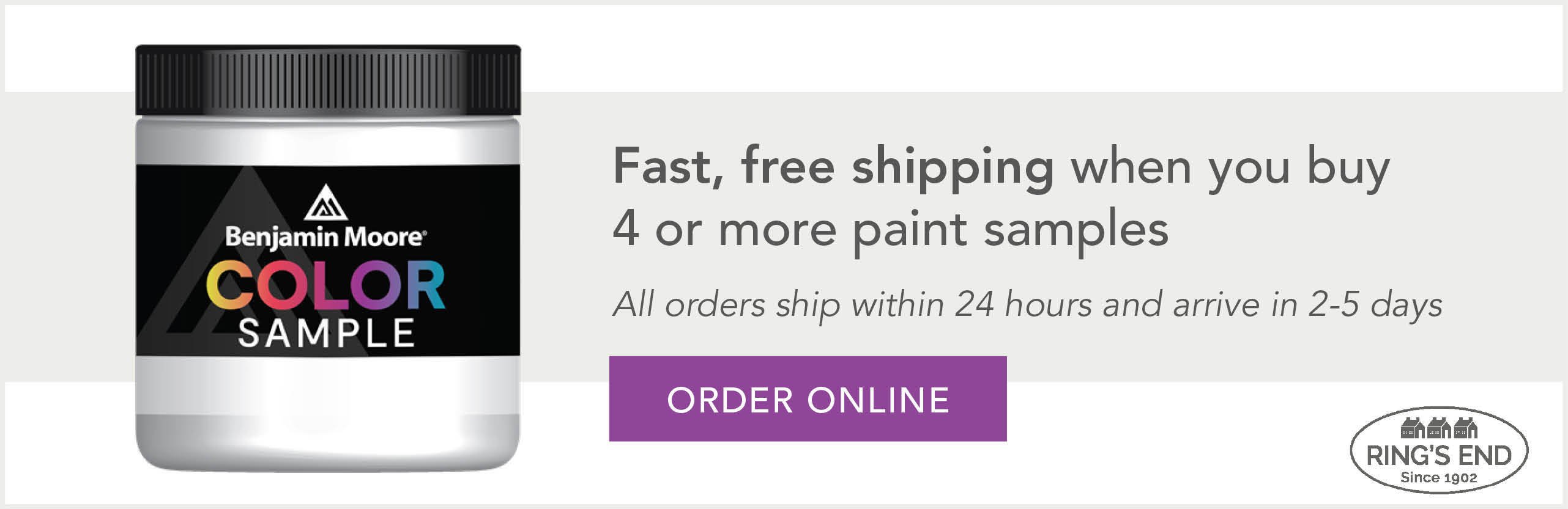
Sampling a Blue Paint Color
Blue paint colors may show different undertones based on the time of day, the type of natural light, and whether it's a north-facing or south-facing room. You can order your Benjamin Moore paint samples, as well as a wide selection of Benjamin Moore paint products, right here at ringsend.com. We offer convenient, fast shipping on all paint products anywhere in the U.S.
Tips for Testing Blue Paint Color Samples
Choosing among Benjamin Moore blues is easiest when you consider the color’s undertones. Even though blue is an inherently cool color, some shades have red-purple undertones that make them warmer, and some have gray undertones that cool them down. While they might not be visible on a paint chip, the undertones appear when you paint the wall. Saturated blues will be more intense on the wall than they are in a sample, and pale blues will be lighter. Blue shades are notorious for looking similar until you put them side by side – and then discover they are miles apart!
First, take the time to choose 3-5 Benjamin Moore blues and order sample pots. You can make your own moveable paint swatch using a 16 oz. traditional paint pots. Paint a large poster board with each blue shade, and move it around the room to observe it on different walls – be sure to compare a well-lit wall and a darker wall. Then see how the paint colors look throughout the day, in natural lighting and by lamplight in the evening.
Always check paint samples against any home decor that you’ll be using in the room to make sure they work well together. Wait a day or two and see how the color behaves in daytime and evening lighting too. Focus on how the colors look with the lighting and furniture in your space, and you’re sure to choose the best blue – a perfect shade you’ll love.
Don't forget to consider the other architectural elements in your room such as trim and ceiling color. Painting the ceiling a color is a great way to amplify a blue wall color. In a dark blue room, a warm beige or gray ceiling color softens the contrast between walls and ceiling to calm and unify the space. Choose a complimentary color like yellow for a bright, sunny look.